Most real estate apps don’t fail because of bugs.
They fail because of bad decisions made long before the first line of code.
Ideas get overbuilt. Features go unused. Admin tools are an afterthought. And suddenly, you’ve spent thousands building something users forget after one tap.
This isn’t rare. It’s normal.
In this guide, we’ll break down the most common real estate app development mistakes—and how to avoid them if you want your app to actually get used, remembered, and recommended.
Nearly 77% of mobile app users churn within 3 days—most because the app didn’t deliver immediate value.
In real estate, where trust and speed are everything, those first minutes are make-or-break.
More features don’t mean more value.
Let’s help you build what actually gets used.
1. Confusing Activity for Strategy
Most real estate apps begin with energy. Long lists of features. Competitive charts. Meetings with too many adjectives.
What they often lack is a clear reason to exist.
Not in the abstract sense — but in the real, product-defining sense. Who are you helping? What friction are you removing? Why will anyone come back a second time?
Questions like these sit at the heart of how to build a real estate app that isn’t just functional, but meaningful—and avoids being just another forgotten download.
“You don’t build a better Zillow by being bigger. You build it by being sharper.”
Before the first line of code is written, the real work is knowing what not to build.
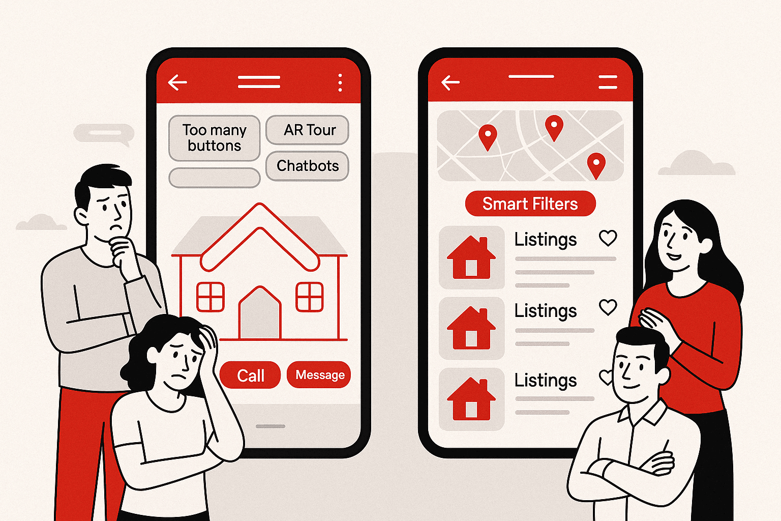
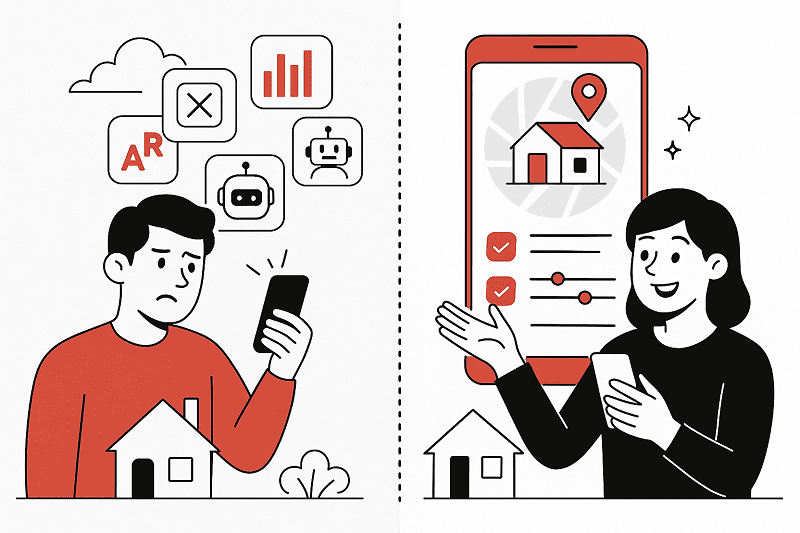
2. Building Features Users Won’t Touch
Nothing bloats a roadmap faster than good intentions.
A 3D tour because it sounds impressive. A chatbot because the competition has one. A dozen filters because… why not?
It’s easy to forget that users don’t come to your app to explore features. They come to solve a problem — fast.
Most real estate features go untouched not because they’re bad, but because they never earned their place. They weren’t tested. They weren’t needed. They just felt like the right thing to build.
That’s what separates useful tools from real estate app features to avoid—the ones that clutter the experience without ever proving their worth.
“Every feature adds cost. Only some add value.”
This is where most real estate apps drift: they trade clarity for complexity. And complexity repels.
3. Copying Big Players Without Understanding Why They Work
Zillow didn’t win because it had the best logo or the longest list of homes.
It won by doing fewer things better: Faster search. Smarter personalization. A clean, map-first experience that just made sense.
But here’s the mistake many new apps make: they copy the look without replicating the logic. They borrow features without understanding the behavior behind them.
That’s the difference between simply mimicking design and studying what makes the best real estate apps actually work—apps that have earned user trust through clarity, speed, and useful behavior loops.
Miss that nuance, and you start solving for aesthetics instead of utility.
So they add a “Premier Agent” tab. Or build their own estimate calculator. Or stuff the homepage with half-baked filters — without knowing if their users even need them yet.
“Emulating the giants only works if you understand what made them matter.”
If you’re planning to build a real estate MVP that stands out, look beyond features and focus on solving a real problem. That’s what Zillow did early on — and why most clones miss the mark.
Trying to build an app like Zillow without understanding the product thinking behind it is what turns most clones into clutter.
4. Underestimating Admin and Backend Needs
One of the most overlooked mistakes when building a real estate app is thinking that the user experience ends at the frontend. It doesn’t.
Yes, users browse the frontend. But your business runs on the backend.
And yet, admin features are usually an afterthought—if they make the cut at all.
No dashboards for managing listings. No role-based access. No content moderation. No reporting.
Until you have 300 properties, 25 agents, a handful of flagged listings, and a client asking why the numbers don’t add up.
“What feels like overhead in month one becomes mission-critical by month three.”
These aren’t “nice to haves.” These are the real estate app features that keep the operation intact. And ignoring them is one of the more avoidable real estate app development pitfalls—but one you only notice when it’s too late.
5. Spending Blindly Without Validating Anything
No matter how sleek your app looks or how big your budget is, building without validation is still just guessing.
Many real estate apps go from idea to development without testing demand, user flow, or feature usefulness. And then come the real costs—not just financial, but technical debt and wasted time.
“You don’t just risk building the wrong product. You risk building the right product in the wrong order.”
The cost of real estate app development doesn’t come from writing code. It comes from rewriting it.
Founders often rush to showcase features without proving if they support real user behavior. But understanding actual real estate app benefits—what users value, revisit, and act on—should guide what you build first, not what just looks good in a pitch deck.
6. Bad UX Hidden Behind “Modern” UI
Rounded buttons. Micro-animations. A gradient that fades just right.
Modern design can make an app feel premium. But polish isn’t the same as performance.
One of the most common mobile app development mistakes is assuming users care about visual flair more than functional clarity. They don’t.
They care about finding a listing fast. About not having to hunt for filters. About tapping something and seeing what they expect.
“If users are lost in your app, the design failed—no matter how good it looks.”
Sometimes, the most “impressive” interface is also the one that leaks the most users. And it’s one of the subtler real estate app development mistakes—easy to miss because it hides behind good design.
7. Forgetting That Media = First Impression
You can have the best property data, the cleanest filters, and the fastest map view.
None of it matters if your media feels like an afterthought.
Blurry images. Stretched photos. Videos that won’t load. Listings without context.
It’s not just about aesthetics. Poor media creates doubt — about the listing, the platform, the experience. And in real estate, doubt kills decisions.
“Real estate is visual. Your app better be, too.”
Media should load fast. Look sharp. And support the one thing every user’s thinking: Can I picture myself here?
8. Skipping Personalization, Notifications, or Habit Loops
You don’t need users to love your app. You need them to remember it.
That’s what habit loops are for.
Saved searches. Smart push notifications. Alerts when prices drop or listings match preferences.
Many of these flows are now powered by AI in real estate, helping apps predict user intent, automate relevance, and improve retention without manual input.
But tech alone doesn’t build loyalty.
These aren’t growth hacks. They’re product memory. And too many real estate apps skip them entirely—either because they feel “marketing-ish” or because they weren’t prioritized at launch.
The most useful real estate mobile app tips aren’t about aesthetics — they’re about building habits users don’t consciously have to think about.
“The best apps don’t just work. They stay in the user’s head.”
Personalization isn’t just a feature. It’s retention disguised as relevance.
9. Designing for Now, Not What Comes Next
Plenty of real estate apps launch with a good front — clean UI, useful filters, smooth onboarding.
But few are built with growth in mind.
They don’t account for multi-region expansion. Or agent onboarding flows. Or listing moderation once there are hundreds, not dozens. Or analytics that actually help improve the product.
“A scalable app doesn’t just add features. It anticipates complexity.”
The most expensive rebuilds don’t happen because the app broke. They happen because it wasn’t built for what came next.
Closing the Loop
Real estate app development isn’t about building fast. It’s about building right.
Most real estate app development mistakes don’t feel like mistakes at the start. They show up later — when features go unused, when the backend buckles, or when users stop opening the app.
You don’t need 100 features. You need five that actually work — and a product that’s ready to grow.
Some mistakes cost time. Others cost users.
Let’s help you avoid both.