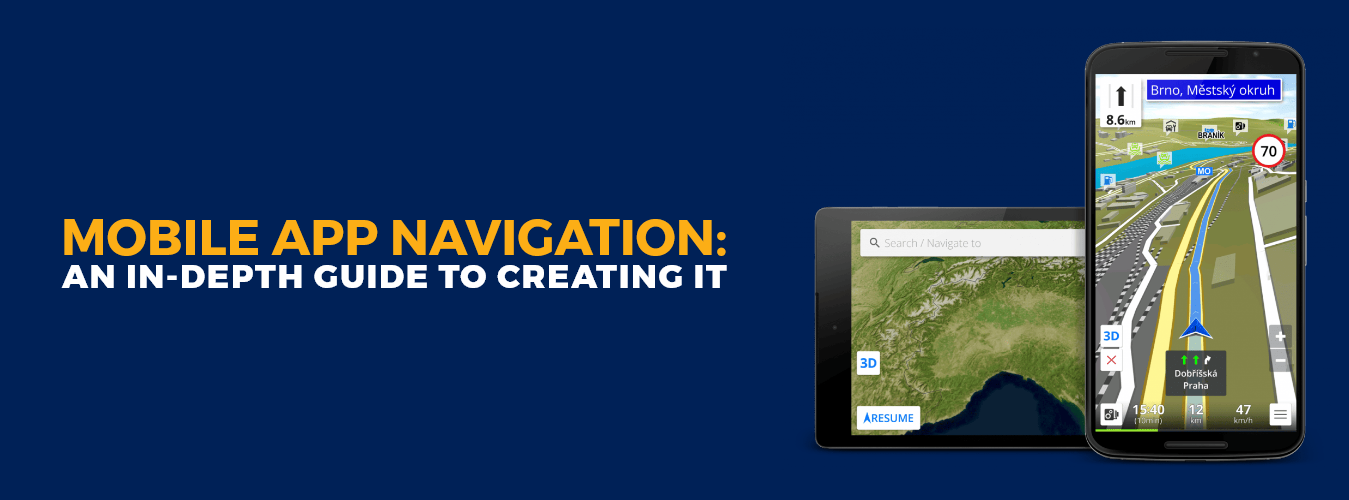
Introduction
A mobile navigation menu is a powerful tool for communicating user intent. It allows users to quickly and easily navigate your app, which helps them find what they need faster. With the rapid growth of mobile applications, creating a seamless and intuitive user experience has become more crucial than ever. Among the many aspects contributing to a successful mobile app, navigation plays a central role in guiding users through the app’s features and functionalities.
This comprehensive blog post will delve into the intricacies of mobile app navigation and provide an in-depth guide to creating a user-friendly and efficient navigation system. Whether you’re a top mobile app development company or a newcomer to the world of mobile app design, understanding the principles and best practices of navigation is essential to ensure your app’s success.
Crafting Your Ideal Mobile App/Experience Starts Here!
Ready to elevate your business? Your custom app is just a click away.
Yes Let’s goWhat is a Navigation Menu?
The navigation menu lists links that allow users to navigate through your app. The navigation menu can be either a static list or dynamic, depending on the type of application you are creating.
In this article, we will cover how to create navigation menus in Android and iOS apps, but remember that similar techniques can be used for any mobile platform or device type (e.g., Windows Mobile).
Creating a Navigation Menu for Mobile Apps
A navigation menu lists links allowing users to navigate through an app. As you design an app, it’s important to consider how these menus will be used and by whom—and this will help you create one that is easy for users to understand and use.
When designing your navigation menu, think about what the user wants from your app; if they’re looking for something specific (like a particular product), then they should have an option listed at the top of each menu item (e.g., “Get Our Special Offer” or “Shop Now”). If not, then try adding more detail within each item so it better reflects what people are looking for (e.g., “Get Our Special Offer” would be better than just having “Shop Now”).
Also Read: How to Create A Mobile App Interface Design
Define Your User Experience Goals
When designing a fitness app, defining your user experience goals is important. What do you want to accomplish?
- You may be interested in tracking steps taken or calories burned. If so, this can be measured as easily with an app as any other activity—you need the right data collection mechanism.
- Perhaps there are other goals at play: your main goal is for people to feel good about themselves and help them reach some specific target weight (e.g., 20 pounds overweight). In this case, the focus should be less on how much activity each person gets done and more on building confidence through self-esteem boosts that encourage success over time.
Define the Contextual Navigation Paths for Your App
When creating the navigation path for your app, it’s important to define the context for each page. This includes defining what information is available on each page and where it appears on other pages.
In some cases, you may have multiple pages that share a common navigation path; for example, if you have an app with multiple categories (e.g., “Home” and “About”), then these two categories will be linked together via their shared navigation menu.
You can also use this shared menu as an opportunity to add additional content to your mobile application by linking additional pages within each category or subcategory of your app—for example, the “About Us” page links back into the “About Us” section when clicked; “Blog Articles” links up through blog articles section.
Also Read: Custom Mobile App Development Boost Your Business
A mobile navigation menu can be a powerful tool for communicating user intent.
A mobile navigation menu can be a powerful tool for communicating user intent. It’s the first thing users see when they open your app, and it gives them an idea of what you’re going to do with their data.
This is especially important because (as we’ve already discussed) people have very little time on their hands these days. If you don’t get their attention right away—if they don’t know exactly what kind of information you want them to find—you’ll lose them forever!
Best Practices to Create Mobile App Navigation
Creating a user-friendly and intuitive mobile app navigation is crucial for providing a seamless user experience. In this guide, we’ll explore the key considerations and best practices for designing effective mobile app navigation.
1- Understand User Needs:
- Conduct user research to identify your target audience and their needs.
- Determine the primary tasks users want to accomplish through your app.
- Define user personas to gain insights into their preferences and behaviors.
2- Keep It Simple:
- Avoid overwhelming users with too many options or complex navigation structures.
- Aim for a clean and minimalist design that prioritizes essential features.
- Use clear and concise labels for navigation elements.
3- Consistent Navigation Patterns:
- Maintain a consistent navigation structure throughout the app.
- Use familiar patterns, such as the tab bar at the bottom or a hamburger menu for additional options.
- Avoid frequently changing the position or layout of navigation elements.
4- Prioritize Key Functions:
- Identify the most important features and functions of your app.
- Make these key functions easily accessible and prominently displayed in the navigation.
- Consider using visual cues like icons or badges to highlight important elements.
5- Use Intuitive Icons and Labels:
- Utilize recognizable icons that represent their respective functions.
- Supplement icons with text labels to eliminate ambiguity.
- Ensure the iconography and labels are universally understandable.
6- Bottom Navigation Bar:
- Consider using a bottom navigation bar for primary app navigation.
- It provides easy thumb access and is familiar to users from popular apps.
- Limit the number of items to a maximum of five to avoid clutter.
7- Hamburger Menu:
- The hamburger menu is a common pattern for secondary or tertiary navigation options.
- Use it for less frequently accessed features, settings, or additional content.
- Combine it with other navigation patterns like tabs or search bars for better discoverability.
8- Gestural Navigation:
- Take advantage of gestures like swiping, pinching, or dragging to enhance navigation.
- Use gestures consistently and provide visual cues or tutorials to educate users.
- Ensure gestures don’t conflict with essential app interactions or native OS gestures.
9- Search Functionality:
- Implement a search bar or icon for users to quickly find content or features.
- Make the search bar easily accessible from any screen within the app.
- Use auto-suggestions or filters to help users refine their search queries.
10- User Feedback and Iteration:
- Continuously gather user feedback through usability testing and analytics.
- Analyze user behavior and make iterative improvements to the navigation.
- Stay updated with the latest design trends and user expectations to refine your app’s navigation over time.
Remember, designing mobile app navigation requires a balance between simplicity and functionality. By understanding your users’ needs and following best practices, you can create a navigation system that allows users to effortlessly navigate your app and find what they’re looking for.
Also Read: Top Technologies Used to Develop Mobile Apps
Conclusion
When it comes to mobile apps, navigation menus are a critical part of the user experience. By using Material Design guidelines as a guide and focusing on what users really want from your app, you’ll be well on your way to creating an intuitive design that will stand out in today’s crowded market for mobile applications. And don’t forget: with great navigation comes great usability, and you can take help from top mobile app development company to get an amazing mobile app navigation.
Crafting Your Ideal Mobile App/Experience Starts Here!
Ready to elevate your business? Your custom app is just a click away.
Yes Let’s go


