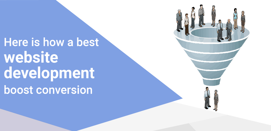
Do you too believe that boosting conversion rate through the website is a hefty job? Are you struggling to increase your web conversion rate? Well many too. Conversion rates are often referred as the hardest job to expect from websites. With years of struggle and effects, several companies do not expect sites as primary conversion rate source, which is why a desk with sales team is added to attend visitors and help a web to serve the purpose.
So how can we improve a website sales conversion rate?
Here are some practices you follow and apply that are studied from various successful web-based companies.
Conversion with Clear Value Propositions

From bringing traffic to helping them with their requirements a visitor expect more than what you can think. The trick is to communicate your value with a proper proposition. A quick example would be Apple website that does not spend a second on their social media but only sell and deliver visitors to their site.
Here we can observe how Apple has kept the image of their product and clear value supports the idea of their product standard.
Best Website Development Company
Website development is a whole separate subject in the design field. Here understanding the importance of website development is crucial, why? Because as a logo designer adheres with logo attributes and values, similarly leading website development companies practice the best design, navigation, and layouts and apply them accordingly.
With a quality layout, impressive alignment and proper CTA placement you need to re-think about menu, banners, and navigation bar and product placement on to your site unlike these top leading medical websites from the USA that are evident. Once you opt for professionals, you relieve yourself from detailed explanations and user-behaviors.
CTA & Attraction

Mozilla received conversion rate beyond expected since after making changes to their CTAs by changing “Try Firefox Now” to “Download Now- Free.” The power of CTAs and their placement over a website matters a lot. Once would not purchase everything instantly and without answering doubts which content has to answers.
Quick Info & Forms
Keeping the essential information such as working hours, email address and location right at the top or at appropriate places will help users to find crucial information without having to skip six different pages to get the required information. With a quick short form, you can convince users to fill up and provide initial details of what they are looking for.

