Mobile phones have become the go-to devices for everyone and important mobile apps their saving grace. An average US user spends around 5 hours per day on mobile with the majority of screen-time dedicated to mobile apps. The demand for better and meaningful apps is definitely there, and the competition to rise to the top is stiffer than ever.
So what truly separates a great mobile app from ‘just another app on app store’?
The quality of user experience (UX).
Users are not just looking for a feature-packed app that does the job for them, but also an app that has a great experience to offer while performing those jobs.
This is why mobile apps have become more and more UX-centric, focusing on experience rather than just app development as a process. The professional mobile app development companies are banking on their skilled UI/UX designers to cater to their client’s projects with the best designing techniques.
This is why whenever we speak about the crucial phases of mobile app development, we include design as one of them.
There are many aspects to consider when you are dealing with the design of your mobile app. Keeping up with design trends, technologies, tools, and standards – there is much that goes into a complete user experience. Let’s explore the many practical applications of a great UX design.
Keep it Clean – Declutter
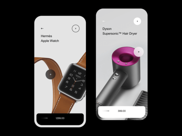
One of the best things you can do for your mobile app design and for your users is creating an interface design that is clean and clutter-free. Remember, users do not have the attention span or the patience to deal with too much content on a single page – it is overwhelming, distasteful, and well, complicated.
Considering the fact that when it comes to mobiles, we already have a smaller screen size to deal with, which doesn’t leave much room for a lot of content cramped within a small space. This is why the term ‘minimalism’ is on the rise in the design realm that reinforces the concept of ‘decluttering’ as ‘less is more’. Not only you get to keep the important and essential elements only, but minimalism allows users to immediately focus on the important task and engage effectively.
So you are looking at a neat UI with improved user experience, resulting in high engagement from the end-user.
Lessen the Workload from User-end
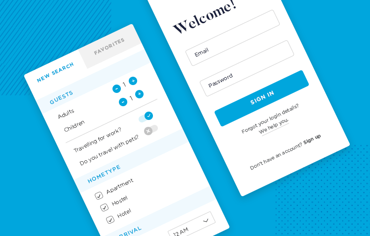
A great mobile app leaves little work for users. For example, some apps use previously entered data or autofill property to fill the forms without users having to do the task manually. Such ease given to the users where they require little effort when interacting with your app places it in their good graces and they consider using it again.
With the saturated mobile app industry, these little considerations in the design go a long way in giving you’re the edge you need over your competitors.
Add Familiar and Standard Design Elements
Familiarity with the design enables users to start using the application without having to face any confusion – and such an app is a winner. So, incorporate standard icons and other design elements including a copy that you know is widely used and immediately understood by the users.
When users are met with an app that is completely alien and pushed the boundaries of being ‘unique’ and ‘innovative’ a little too far –they are bound to feel confused and stressed leading to app abandonment or uninstallation.
So, keep the learning curve as little as possible when it comes to design and usability.
Break the Tasks into Smaller Sections
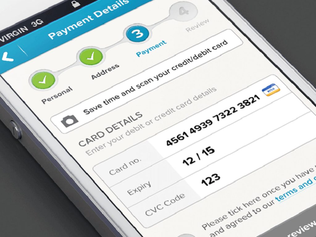
You must have encountered important apps that require an elaborate sign-up process including various personal details including bank account information as well. Those apps, instead of having a long one page of several fields for the user to fill and feel annoyed – it is rather broken into multiple screens containing few fields to fill – like a step-by-step onboarding or checkout process.
Keep the Design Consistent Throughout
One of the factors that enhances the user experience is a consistent similar pattern of the design. This removes any possibility of confusion from the user’s end, and a similar pattern of design encourages ‘familiarity’ and ‘remembrance’ of certain elements including the logo of your app.
So what areas come into consideration when we speak about consistency?
There are three main areas to note: Visual, Functional, and External. When it comes to the visual aspect, we speak of buttons, labels, text fields, so on, and so forth. While the functional area includes the interactive elements; keeping them consistent throughout the entire mobile app ensures smooth user interactions.
Now, what is left is external consistency, which entails that the design of your app should be consistent throughout various different products. Why? Because the factor of familiarity with your design will make it easy for them to use another product.
Make Onboarding a Fun Experience
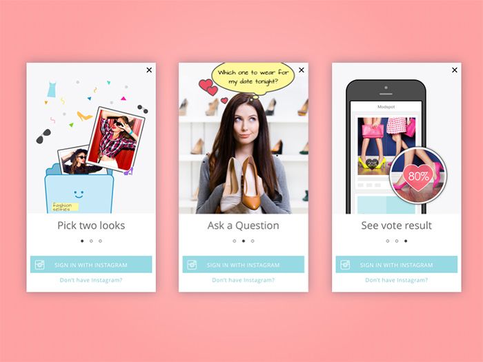
Just like the first impressions counts, similarly, your first experience determines the future of your app with that particular customer. Your onboarding experience is one of those impressions. This is why, you need to make the onboarding experience as quick, easy, and as enjoyable as possible.
Make sure you are asking the necessary details only. Moreover, you can also dive into ‘contextual onboarding’ – meaning, that each user receives the right message to sign-up at the right time.
In Conclusion
Mobile apps’ designs largely dictate their success and great UI/UX teams, such as at AppVerticals, a professional mobile app development company in USA ensures these best practices are met.
Of course, the entire process of designing a mobile app isn’t a one time process but in fact, is a continuous cycle of evolution as the app scales and grows. So, if you require a mobile app that has an impeccable design, great functionality, is easy to use, and adds value into the lives of your users then connect with AppVerticals – where your mobile apps are designed to perfection.


