Of course, good keywords, meta tags, and original content can do wonders for your website. However, you cannot overlook the user experience and user interface. That means that you ‘need’ a good website design. Just like your creative business ideas, there are countless ideas for a creative eCommerce website design as well.
You can get as innovative as you like, play with your site, make it unique, make it the best, but, do your website right. There are certain guidelines that you have to keep in mind while designing a website as well. Why? Because a website design is just as important as its functionalities.
When a user enters your website, the first thing his eyes will fall on is the overall look and feel of your site. So you have to be able to pull off the first impression.
Here is how you can own a remarkable looking eCommerce website.
#1 Quality Imagery
You might be thinking, ‘Ugh! Here is a typical 101 that I’ve heard countless times and over!’, but, trust me there is a reason for the strong emphasis that images and typography receive.
The modern society is all about visuals; pictures are found everywhere and the trend for quality photography is drastically increasing. People are attracted to pictures more than the content; the reason behind this is that the human mind processes visuals 60,000 times faster as compared to written content.
So good photography is obviously very important for attracting users. I know you would do anything to increase your website’s traffic, there can’t be a simpler or effective method than this.
Still not persuaded?
If that’s not good enough, here is another reason why quality imagery is compulsory for a good eCommerce website design.
The first things that customer look for in your products are pictures (well, at least those that want quality). A description is helpful, but, customers want to see how a product looks.
Quality images can do wonders for your site:
Enhance SEO:
Content may be important, but as the old saying goes “A picture is worth a thousand words”.
Now, search engines can’t exactly understand images (although ‘visual search’ will pretty soon allow this feature as well). Use images that are relevant to your products, include good image names, image title tags, and alt text descriptions. This will further enhance the SEO of your site.
Convert Leads:
Pictures have a way of bringing emotions to the surface, they can connect with users and awe-inspire them. Users will spend more time on your site, this means that there will be a reduction in the bounce rate, an increase in user engagement and eventually you will have potential customers.
Sell More:
When customers see crisp, original high-resolution pictures, they feel that you have taken the time to provide authentic images of your products. This will build customer trust and they would ultimately want to purchase your goods and services.
How can I do it:
Here is how you can generate quality images for a good eCommerce web design:
-Take original pictures of the products yourself.
-Use stock images taken by professional photographers.
-Have a professional photographer shoot your products (preferred method).
#2 Responsive Web Design
Usability is an important element for a good eCommerce website design and making your design responsive is the key to good usability.
What is a responsive web design?
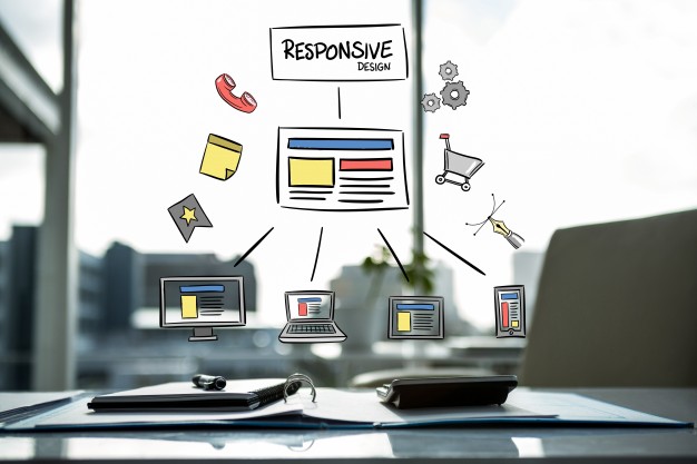
In simple words, a responsive website design is a design that is equally compatible with all types of screens. A good website design would suit smartphones, desktops, tablets, and all other types of screens.
People use all kinds of devices, in order to expand your customer reach you will ‘have to’ make sure that your design is responsive.
How can you make a responsive web design?
In just three steps, I will tell you how you can design a responsive eCommerce website.
Use A Fluid Grid:
Fluid grids use the concept of natural fluids. If you think about it, a fluid is a substance that can transform its shape with respect to an applied stress or an external pressure.
Similarly, ‘Fluid grids’ are able to transform themselves to match the devices that contain it. Fluid designs are able to adapt to all types of devices and screen sizes.
Due to this adaptability, this method is much more convenient as compared to the traditional pixels based method.
What it does: Fluid grids will allow you to easily adjust the size of the elements for different devices. The elements will adjust themselves according to the screen size of the grid and not according to the pixel measurements.
Touchscreens Are Important:
Design your website by keeping in mind the mouse and touchscreen users. Design your form so that any menus or drop-downs are easily accessible by touchscreen users.
Manage Images:
Decide if you will be removing or re-sizing images for different screen sizes. You can make rules on your CSS to determine how the images will be handled.
Elements For Small Screens:
When moving from larger to smaller screens, you will have to decide how to manage the elements on your site. For very small devices you might even have to remove some elements.
Most developers compress the menus and navigational options into a single button. On selecting the button, the menu can expend for a larger screen but for devices with smaller screens, it can be opened on the full screen. By using your websites CSS, you can set rules for including or removing elements for different types of devices.
Outsource Your Project:
If you don’t have the knowledge or the right tools to make your website design responsive, you can always get it custom made. A company like AppVerticals is experienced in delivering responsive websites that are relevant to your needs.You can also get the work done by hiring a freelancer.
#3 Products First
Generally speaking, customers want to see the ‘products’ that you are selling; That means that your site must be all about your products and must focus on the goods and services that you offer.
Here is how:
Easy To Navigate:
Make sure that your customers can easily find what they are looking for. When a user searches for a product, your site must effectively lead them to it without any hustle and bustle.
Authentic Product Images:
Once again, customers want to see what the products look like. The product images that you provide must be professional looking, with high resolution, good lighting, and an accurate size.
Bestsellers & Product Reviews:
Use a layout that enables you to show the best sellers and products reviews. This will give a touch of social proof and build customer trust.
Product Recommendations:
By recommending related products, you offer your customers a wide variety of product options, this can be very useful for customers and can also increase sales.
Product Information:
Provide all the information about your product, including the material, color, features, measurements, price and the amount of stock available. Giving the right information will increase the accuracy and reduce customer queries.
#4 Easy To Navigate
Poor website navigation is one of the common mistakes made by startups in websites. Startups want to look original so they decide to sway from the standard layout procedure or add excessive options in the menu. Being original is a great idea, but only if it can satisfy your users.
The problem is that customers are used to the standard procedure if they don’t understand your site’s navigation they will ultimately leave your site. After all, there are so many other options in the market.
E-Commerce website design for user-friendly navigation:
Follow The Standard Layout:
Make sure you follow the standard navigation layout procedure. The placement of the navigation bar must be along the horizontal at the top or along the vertical on the left side.
Unclutter Your Website:
People want the required information within seconds, cluttered menus with inaccurate and excessive options will confuse the visitors. Unclutter the menus, keep it simple, keep it consistent and only provide the relevant options for easier navigation.
#5 Shopping Cart
When customers have added items to their shopping cart you want to make sure that they continue to purchase the items. You can design easier cart navigation or pop-ups to encourage visitors to continue the purchase.

Here are a few tips that you can use for a good shopping cart design:
Add Both Mini And Full-Page Shopping Carts:
A mini shopping cart is convenient for shoppers who want to keep track of what they buy and how much they will be spending. A full-page shopping cart provides more information and options for the products.
Step-By-Step Checkout:
A step-by-step checkout procedure is easy to understand and follow. This allows customers to easily purchase the goods without any complexity.
Readability:
Use tables, standard font size, and an approachable layout so that customers can easily understand the shopping cart. Make sure that all the content and visuals are well organized and representable.
Avoid Adding Multiple Fields:
Too many options and excessive fields can confuse your customers and lead them to doubt your website. So keep the shopping cart simple and professional.
#6 Keep Ads At A Minimum
Excessive advertisements can potentially kill your eCommerce website design.
Drawbacks of excessive advertisements on website design:
Cluttered Website:
Too many ads will clutter the website, annoy the visitors and will negatively impact the web design & layout.
Unprofessional Profile:
Excessive advertisements will give an unprofessional look and feel to your site. This can lead to customer distrust and increase in bounce rate.
Viewing Complications:
Too many ads and pop-ups can cover the website content and cause a number viewing complications, including, website lag and browsing problems.
#7 Some Essential Do’s And Don’ts For A Successful E-Commerce Web Design
Do’s:
- Don’t forget to use whitespaces, they add clarity and consistency.
- Using standard fonts is a plus point for a website design.
- Keep a consistency in the user interface
- Get your design tested! Yes, it’s necessary.
Don’ts:
- Too much content and excessive text is hard to read and complicates the design.
- Adding too many pictures is an absolute no.
- Inconsistency in font type & size is a design killer.
- Flashy carousels are highly unattractive
Bottom Line:
A poor eCommerce web design can frustrate your visitors, cause harm to your brand’s reputation and ultimately decrease sales.
A successful eCommerce website is able to immerse visitors and evidently convert them into potential customers that keep coming back for more. Technology advancements have obviously leveraged our expectations, users that interact with websites expect an exceptional user interface, if you can’t deliver what they expect, then they will simply move on to a new site; That is why successful businesses work hard to cater to their customer’s needs. For this reason, a good website design is one of the essential methods that can develop a customer’s interest and an everlasting loyalty.

