Specific trends get in for a smaller or longer duration in every industry. Especially in the web and IT industry, new trends get introduced and become mainstream until something better doesn’t replace it. Ever since the beginning of technological evolution, a lot of trends enters and exit. With innovation, better opportunities come. This makes businesses and website owners to implement better changes in their websites. And, this is how new trends are formed.
Major Web Design Trends for 2020
Website development companies can develop unique pages, but without the incorporation of at least a little of the major ongoing trend, the site seems to be unfashionable that eventually leads to an uninteresting website. So, in order to be engaging, a web application development company needs to include some interesting features and the latest trends on their website or mobile app. These are the latest web design trends for 2020.
- Adaptive design
- Interactivity
- Minimalism
- Push notifications
- Motion design
- Video
- Chatbots
- White space
Adaptive design
Adaptability is one of the most trending and important requirements for web design and development. Adaptive design is not only a trend but an essential requirement that is now considered as a major web-design element. The major concern for adaptability is mobile screens because they are used no less than the laptops and window mode. And secondly, the focus revolves around the browser window mode adaptability. browser window mode is often used to view multiple web pages simultaneously.
It needs to be taken care of that the significant elements of a web page must not disappear from the screen.
Many people instantly leave non-adaptive websites because it is inconvenient for them to use. So in 2020, web and mobile app developers focus on the adaptive web design to save users from difficulties.
Interactivity
The technological evolution has led us to the time where a high-quality web design incorporates more complex and dynamic elements. Therefore, today there are a lot of micro-interactions, integrated videos, animated scrolling and a lot more.
Minimalism
Minimalism is a fastly evolving concept that focuses on making the web design simpler, easier and better. Minimalism influence both web and mobile app developers to simplify the UI in these ways:
- minimum colors
- lack of additional details of graphic design including shadows, font, images
- minimum of buttons
- hidden navigation bars
Minimalism is one of the most trending web design fashion that is predicted to continue even after 2020. Minimalism simply involves simplification with the display of as few elements as possible on one page. An example to take inspiration from is the Apple Website.
Push Notifications
Push notifications are getting in trend for quite some times. However, it remains a controversial trend due to the annoyance associated with it. Many users find it unpleasant to see a notification from a website while working on mobile screens or laptops, particularly if the notifications are repetitive. However, many users do subscribe to it, too because often it contains some benefits. For instance, a sale alert or a promo for a discount. Although, this is something related to the job of web or mobile app developers but also involve UX.
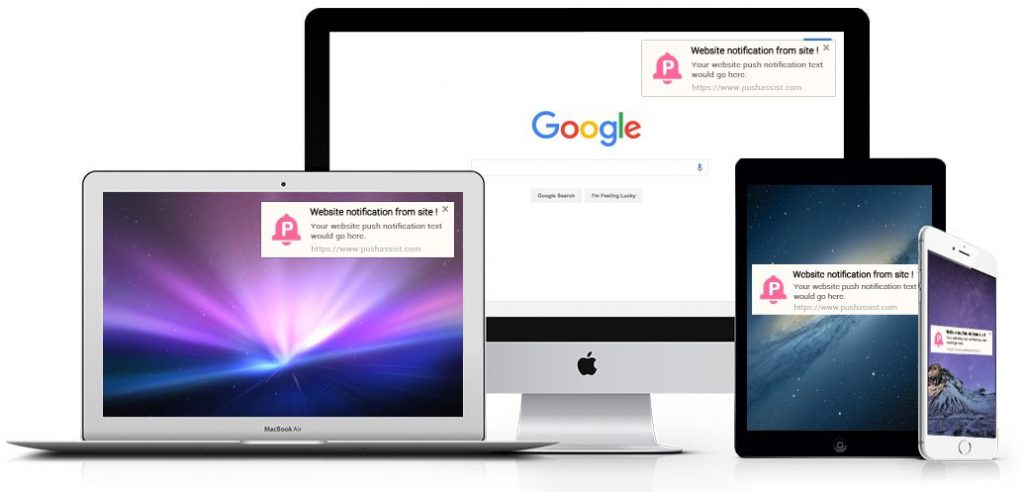
moreover, notifications are easily block-able. This eliminates the annoyance factor too. In addition, push notifications are often not considered as unbearable on a tablet or phone devices. Instead, they are often useful than annoying. Most sites already ask permission before sending notifications. Hence, while adding this element to your website, it is wise to take into account the target audience and its needs.
Motion Design
With the impatient nature of the time coming ahead, everything has started moving fast. This applies to the website users as well when they want everything to be presented instantly on a website.
Motion design particularly enables website and mobile app developers to provide more information in less space. GIF-animations are an example of motion design to familiarize with the basic concept of the given idea.
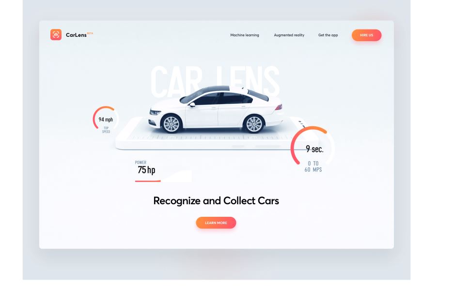
Image Source
This is a more effective way of presenting information than through text or images. Gifs are fast loading and lighter, and this adds up to a website’s efficiency. They are convenient for delivering the idea in minimal time. Moreover, they are good to keep the users engaged. As a result, they will stay more on the site.
However, as a rule of thumb, don’t make the gif longer than 5 seconds while making sure to deliver the message within this period, or you can choose to include a video.
Video
It is not new to include videos on the websites. However, the idea is becoming more trendy as we move towards 2020. Video is a strong tool to let the user stay on your website. If your content is enough engaging, the user probably desires to stay more on your site. Meanwhile good video content increases curiosity among the users to check out your website. website and mobile app developers must know how to make use of effective video, you can engage your audience.
Following are a few which need to be taken care of while adding videos to your website.
- Relevance. The video should be related to the on-page content. For instance, do not post “Our team” content on the page “Why work with us”.
- Duration. Videos should not be longer than five minutes. This time duration is enough to describe the project. The intent of adding a video is to attract the user’s attention and make them look more.
- Minimalism. Adding video doesn’t mean that you need to present everything through clips. Basic information must be submitted in the textual format.
- Simplicity. Use videos to deliver the main message only because moving away from the topic will make the user bored.
Chatbots
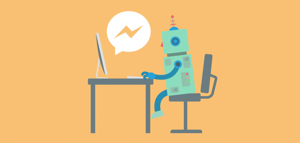
Chatbots are one of the most emerging trends of this age. They work on the mechanism of artificial intelligence. Users often look for support with their queries of all kinds. Generally, over time they coincide, and it is more and more difficult to respond to a large number of queries at the same time.
Chatbots are programs which are designed to imitate a conversation as if they are human. Currently, the trend is developing and improving over time, becoming more efficient and human-like. They learn over time and collect a base of constant and usually asked questions. And, in the future, they used that base to respond to interested users immediately.
White Space
white space refers to the use of background space in a way that it adds value to the overall design of the website or a mobile app. It is an effective way to attract attention and focus to the focal point of the page. Generally, white space means the area between the design elements and the space between some elements of the Web page, including line spacing and space between text.
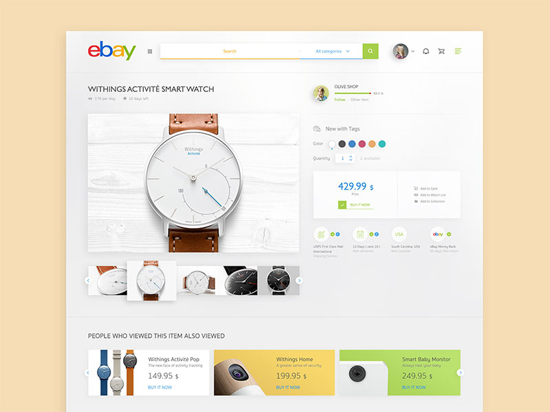
white space is not necessarily exact white. It can be of any color (mostly light), texture or a background image. White space conveys no meaning but adds value to the actual message that needs to be focused.
If you are web or mobile app developers /designer, it is crucial for you to take care of the white while developing your website or app. White space also contributes to enhancing the aesthetics of the page. This typically covers line spacing, paragraphs space, space between images and other similar elements. Here is a good read to know more about making your website UX better.


